AR Usability Study for Hope for Haiti Foundation
- Duration
- Jan - June 2023
- Role
- Lead UX Researcher
- Methods
- Think-aloud Testing, Interviews
- Team
- Snap AR Scholars
Introduction
To help the Hope for Haiti Foundation create a more immersive connection with its donors, I led a UX research initiative with a team of Snap AR Scholars to explore how Augmented Reality could showcase their schoolhouse projects.
Our design team prototyped two high-fidelity 3D virtual replicas of a schoolhouse: an Embodied Virtual Hand for physical interaction and a more traditional Screentouch interface.
My primary goal was to determine if these experiences could reduce donors' mental distance and foster a stronger connection to the projects they support.
The Prototypes
1. Embodied Virtual Hand Interface
2. Screentouch Interface
Research Objectives
I designed this study to evaluate the overall usability of the AR experience and to compare user preferences between the Embodied Virtual Hand and Screentouch interfaces to see which was more effective.
Participant Selection Strategy
Due to time and resource constraints, I opted for initial usability testing with a college student sample. This allowed my team and I to efficiently identify core usability issues before expanding to Hope for Haiti's diverse donor base.
My Research Process
I selected a think-aloud usability testing method to gain direct insight into user behavior and in-the-moment feedback. I designed and led 50-minute sessions where each participant:
- Engaged with both the Embodied Virtual Hand and Screentouch AR prototypes.
- Verbalized their thoughts, expectations, and frustrations as they navigated the experience.
- Attempted to complete specific tasks within the virtual schoolhouse environment.
- Participated in a semi-structured interview with me following the tasks to elaborate on their experience.
Participants
- Sample Size: 6 participants
- Age Range: 19–27 years
- Gender: 4 Female, 2 Male
- Race/Ethnicity: 5 White/Caucasian, 1 Other
Think-Aloud Usability Testing
We used a single 50‑minute session format:
- Interact with both Embodied Virtual Hand and Screentouch UIs for ~15 minutes each.
- Followed by a ~20-minute semi-structured interview.
- Interactions documented through video recordings and observation notes.
Tools I Used
Recording: Phone camera and audio recorder
Transcription: Otter AI
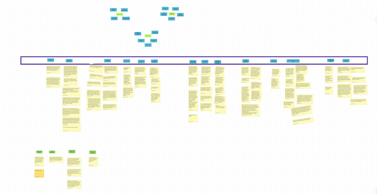
Analysis: Canva for affinity mapping
Surveying: Qualtrics for post-experience feedback
Data Analysis Approach
After the sessions, I led my team through an affinity mapping exercise to analyze the qualitative data. This collaborative approach was the most effective way for us to synthesize observations into patterns, identify critical usability issues, and prioritize our findings based on their impact.
Key Findings
Finding 1: The Virtual Hand Interface Challenged Users' Depth Perception
Observation: During testing, I observed that users consistently struggled to gauge distance and interact with objects accurately using the virtual hand.
"I almost feel like you have to reach too far to grab it. If it feels too far, it feels closer to, I don't know" (00:09:00)
Insight: This difficulty frequently broke the sense of immersion, leading to frustration and reducing the feeling of embodiment we were aiming for. Without accurate spatial interaction, the interface failed to decrease psychological distance, undermining a core project goal.
Finding 2: The AR Environment Lacked Sufficient Interactive Depth
Observation: Users quickly exhausted the interactive elements within the virtual schoolhouse and expressed a desire for a richer, more explorable environment.
"Um, the classroom's pretty empty, so, maybe like a bookshelf?" (00:02:45 - 00:03:00)
Insight: The sparse environment limited user immersion and reduced the potential educational value. We missed opportunities to use objects to tell a deeper story and enhance the emotional connection for donors.
Finding 3: Users Faced a Clear Trade-off Between Engagement and Ease of Use
My analysis revealed a distinct preference split. While the Virtual Hand was seen as more engaging and novel, the Screentouch interface was significantly easier to use. This highlighted a classic tension in interface design between immersion and usability.
My Recommendations
Recommendation 1: Enhance Depth Perception with Visual and Haptic Feedback
Based on my findings, I recommended that the design team implement improved depth perception cues to boost user confidence and reduce cognitive load.
Key Actions I Proposed:
- Implement visual and haptic feedback (shadows, highlights, vibrations) to make interactions feel more tangible.
- Develop a brief onboarding tutorial and test multiple depth perception techniques to find the most intuitive solution.
Recommendation 2: Enrich the AR Environment with Culturally Relevant Content
I also recommended that the team enhance the AR environment with culturally relevant elements to create a more immersive and educational experience for donors.
Key Actions I Proposed:
- Enrich the environment with interactive, culturally relevant objects (e.g., decorations, materials from Haiti) that tell stories about the school and students.
- Add informational hotspots and ambient sounds to explain donor impact and make the virtual space feel more alive.
Learnings & Reflections
This study sharpened my ability to evaluate spatial interfaces and surfaced how much the physical setting shapes AR usability. Running think‑aloud sessions revealed specific interaction pitfalls (e.g., depth perception, task clarity) and improved how I translate in‑the‑moment behaviors into clear, testable design hypotheses.
Most importantly, it reinforced balancing novelty with usability. The recommendations centered on practical cues (depth feedback, onboarding, richer context) that reduce cognitive load and strengthen connection to purpose—turning research insights into changes that matter for users and stakeholders.